CANOPY / ENTERPRISE · IOT PLATFORM
Making complex systems feel manageable.
I redesigned Canopy’s device-management platform from the ground up, culminating in version 3. The challenge was to make its capabilities easier to find, understand, and adapt to everyday work.
- MY ROLE
- Lead UX Designer
- WHEN
- 2019–2024
- FOCUS
- Research, product strategy, interaction design, design systems, front-end development
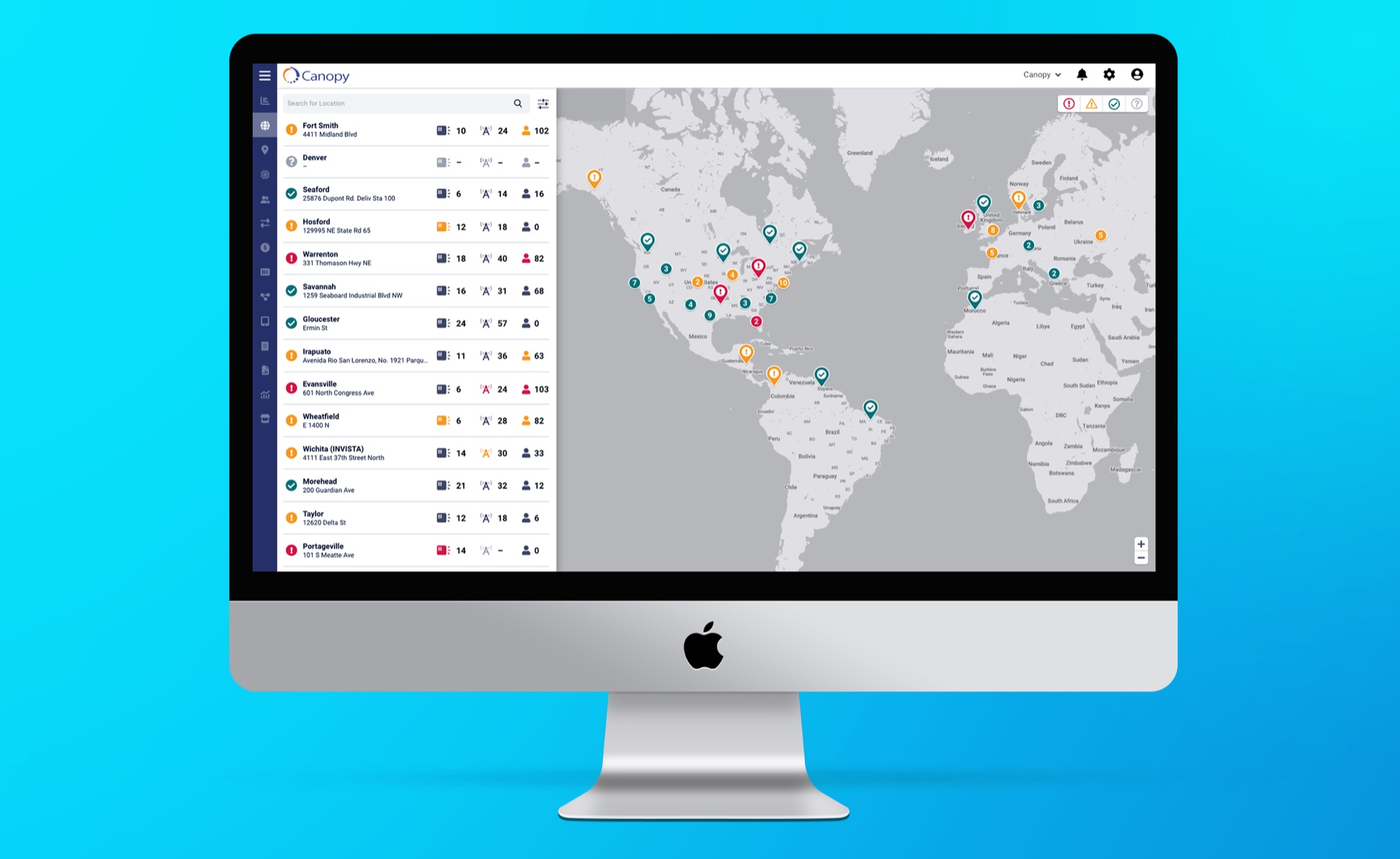
AT A GLANCE
Canopy
As Canopy’s sole designer, I redesigned the platform from the ground up, helping shape product priorities and owning UX and UI design. I worked directly with developers to bring version 3 to life.
WHAT THE WORK DELIVERED
A ground-up redesign of the entire Canopy platform, culminating in version 3.
CONTEXT & APPROACH
Make complex tools easier to work with.
The redesign spanned the entire platform. Page Builder and pinned actions illustrate two decisions within that broader effort.
Canopy helps teams monitor and manage networks of smart devices. Experienced administrators needed depth, while newer users struggled to find basic functionality. Customers also wanted to white-label the platform for their industries.
I reviewed workflow analytics, interviewed experienced and newer administrators, and used surveys to understand recurring frustrations. The priorities were clearer access to actions, better filtering across large networks, and more adaptable workspaces.
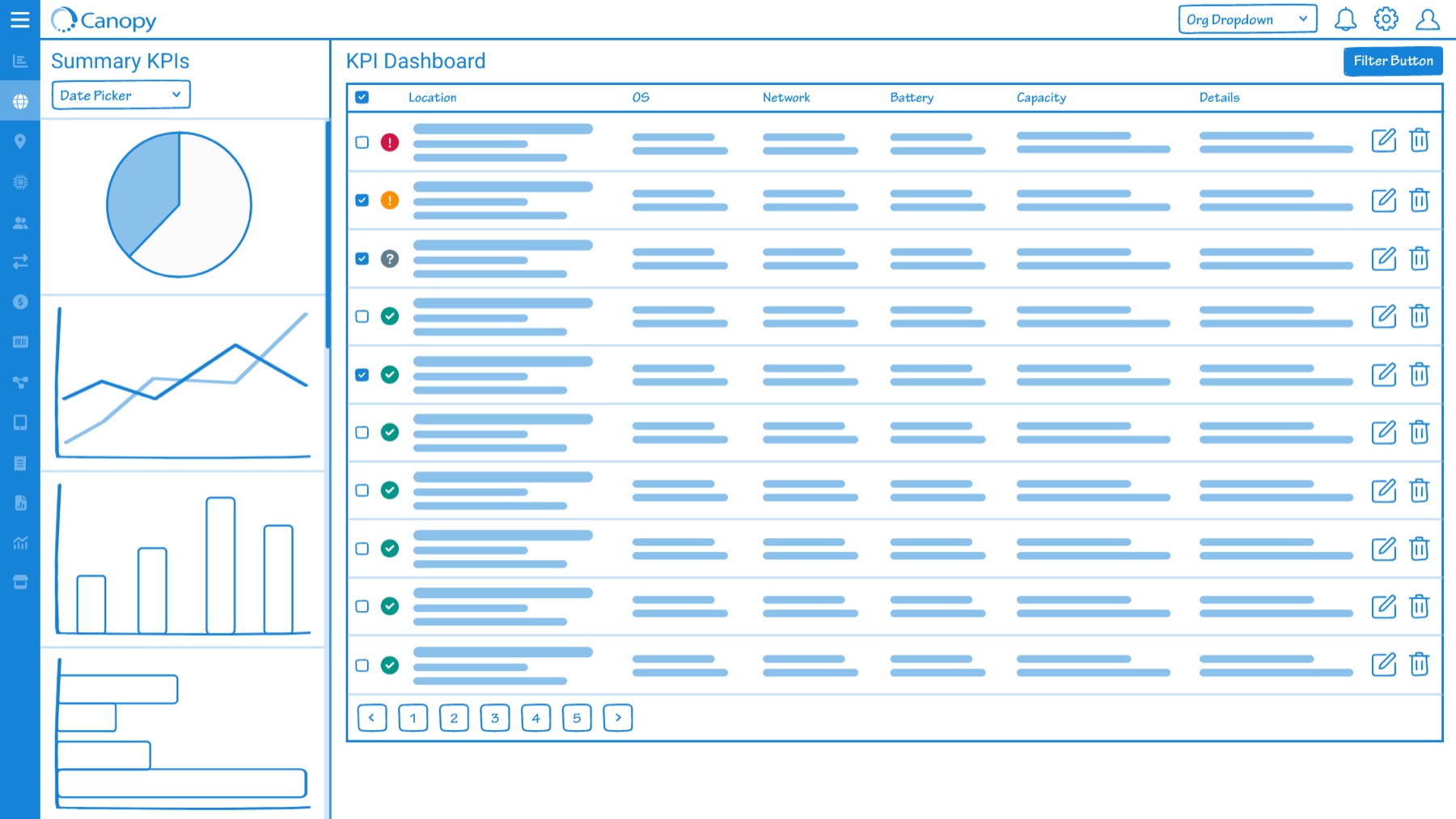
I explored workflows in wireframes and built on Material Design, giving the platform a shared foundation without reinventing basic components.
PAGE BUILDER
Give customers flexibility within a consistent structure.
Customers wanted industry-specific pages and branding. We were meeting those requests through custom pages and one-off features built à la carte.
I proposed Page Builder as a reusable alternative. The design would let customers choose widgets, arrange layouts, connect data, and apply their branding.
The central challenge was balancing layout freedom with usability. I used a grid and predefined widget templates to provide structure while allowing customers to assemble pages around their workflows.
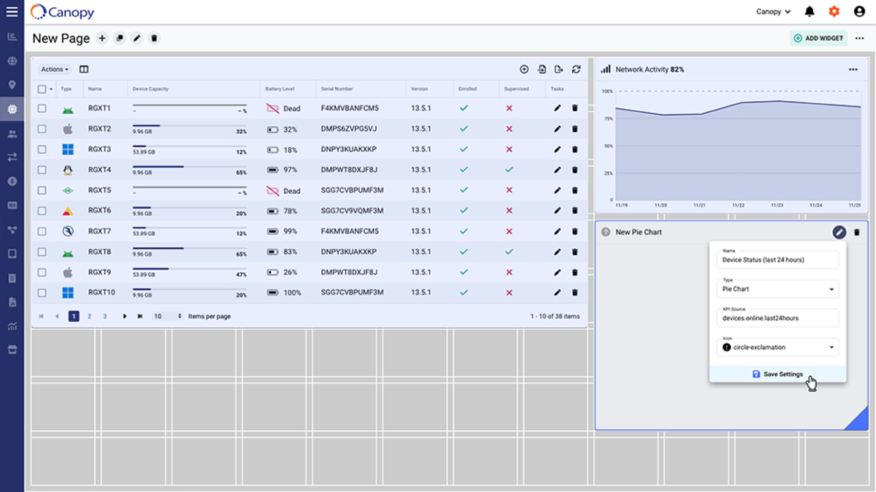
Implementation status: Page Builder was partially built. Team restructuring shifted priorities, and the feature was deprioritized before full implementation. Its potential to replace custom development remained unvalidated.
PINNED ACTIONS
Keep valuable actions within reach.
Users had to scroll through a long dropdown to find frequently used commands. We added the ability to pin actions to the top of the dropdown, making those commands accessible elsewhere in the platform, including tables, cards, and modals.
Customers could surface the actions they considered most valuable while retaining access to the complete action list.
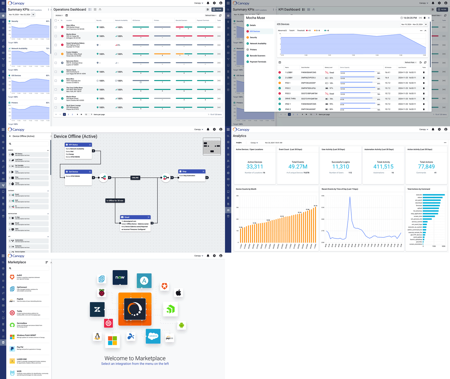
Shipped outcome: Pinned actions received a strongly positive response, supported by direct customer feedback, account-team reports, and observed usage. Customers used the feature to make their preferred commands accessible throughout the platform.
REFLECTION
Two ways to make a complex product more usable.
Pinned actions improved access to existing capabilities and gave customers control over the commands they saw. Page Builder addressed a broader customization need, but its intended benefits remained untested.
Together, they capture the balance I was working toward: a consistent product structure with room for customers to tailor the experience to their work.
Field teams later surfaced a need for mobile form factors. With more time, I would have prioritized usability testing with those teams to understand how their tasks differed from desktop administration.