Canopy
I was brought in to lead a strategic redesign of Canopy, an IoT platform used to monitor and manage networks of smart devices across industries. Despite its technical power, users reported frustration with navigation, discoverability, and customization. My goal was to transform Canopy into a more intuitive, flexible, and scalable experience—without losing its depth or functionality.
Discovery & Research
To ground the redesign in user realities, I conducted a multi-layered discovery phase:
-
Analytics Review: Uncovered high drop-off rates in core workflows, like device actions and alerts.
-
Interview: Spoke with a cross-section of power users and novice admins to identify pain points in daily tasks.
-
Surveys: Gathered broader quantitative insights on feature usage, satisfaction, and key frustrations.
Key Insights
The discovery phase led to the following key findings:
-
Overly Complex UI: Users struggled to locate basic functionality, even after onboarding.
-
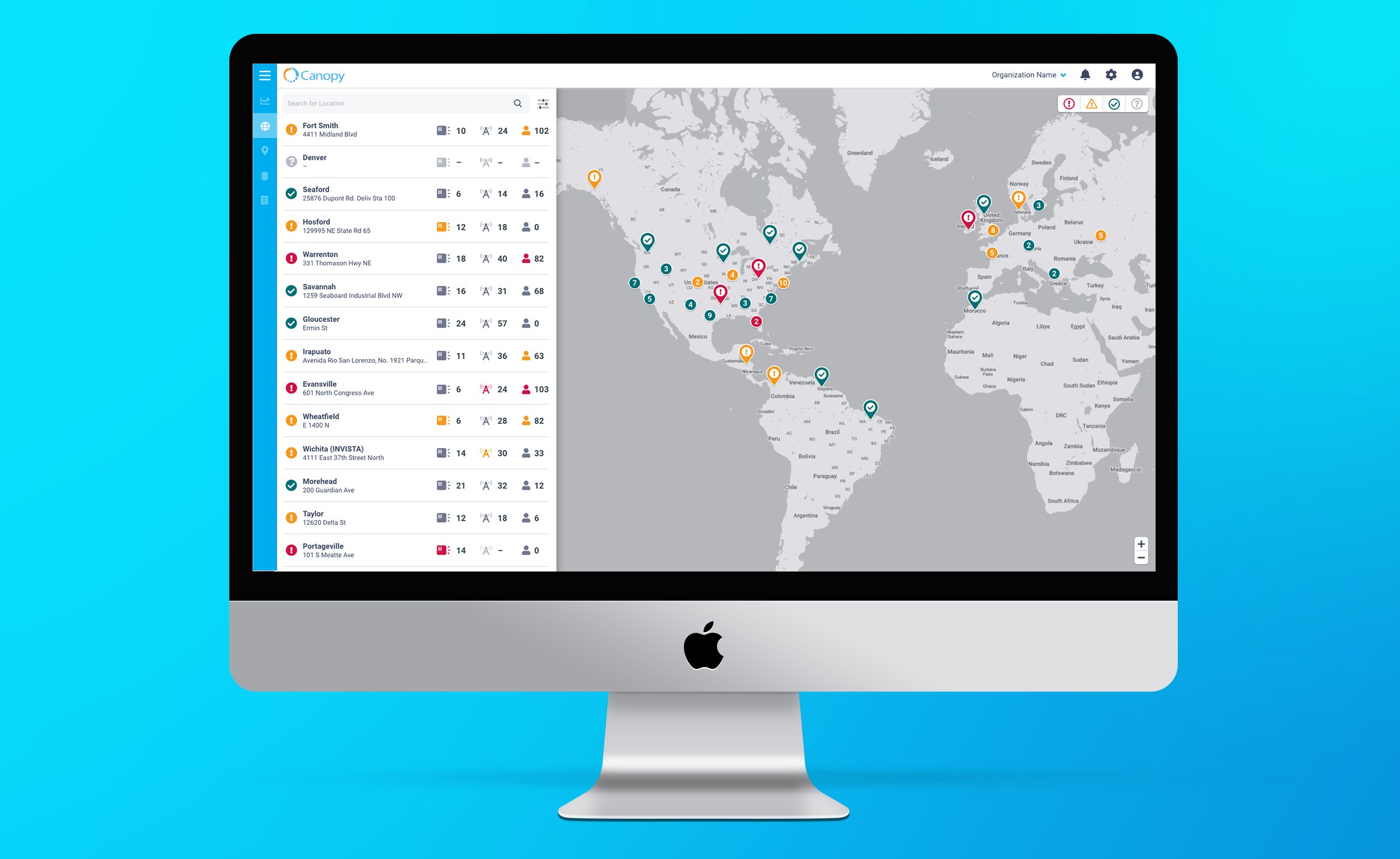
Weak Filtering: Teams managing thousands of devices couldn’t narrow results effectively.
-
Rigid Layouts: Users wanted more control over dashboard and workflow customization.
Strategy & UX Approach
I framed our design priorities around three principles:
-
Simplify the Interface: Clarify navigation, reduce clutter, and priortize core actions.
-
Design for Scale: Enable efficient control of hundreds/thousands of devices.
-
Empower Personaliztion: Let users configure the product to match their workflows.
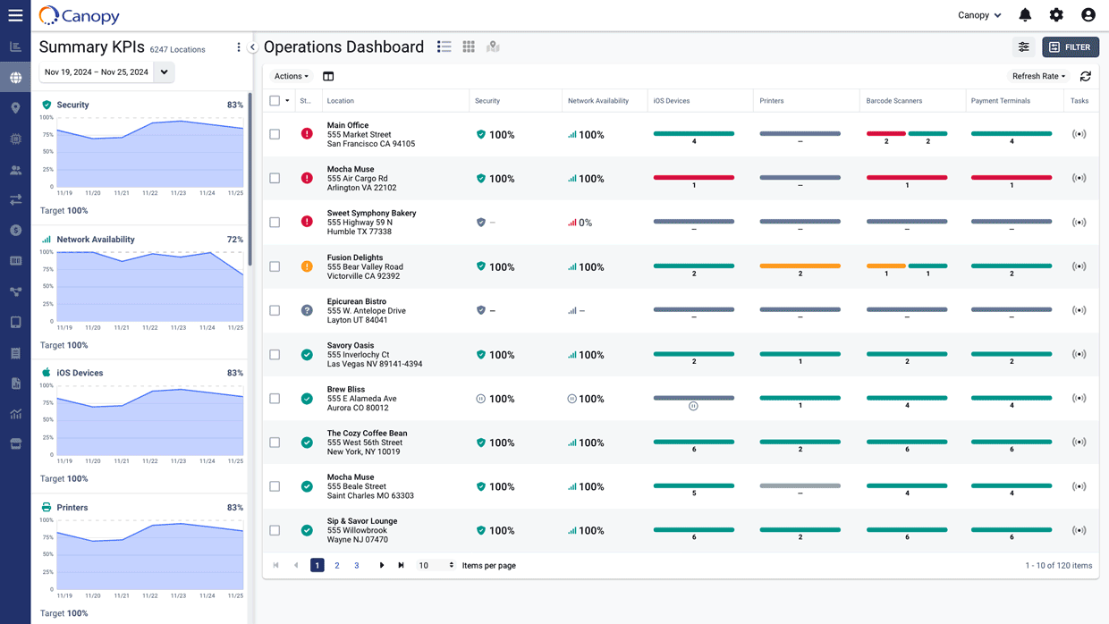
UX & UI Design
I mapped out core workflows using wireframes to explore IA and layout. These were shared early and often with stakeholders for feedback.
Once validated, I transitioned to high-fidelity designs. I based our system on Material Design, allowing us to spend less time re-inventing the wheel and move quickly while focusing our design energy on Canopy’s more unique components.
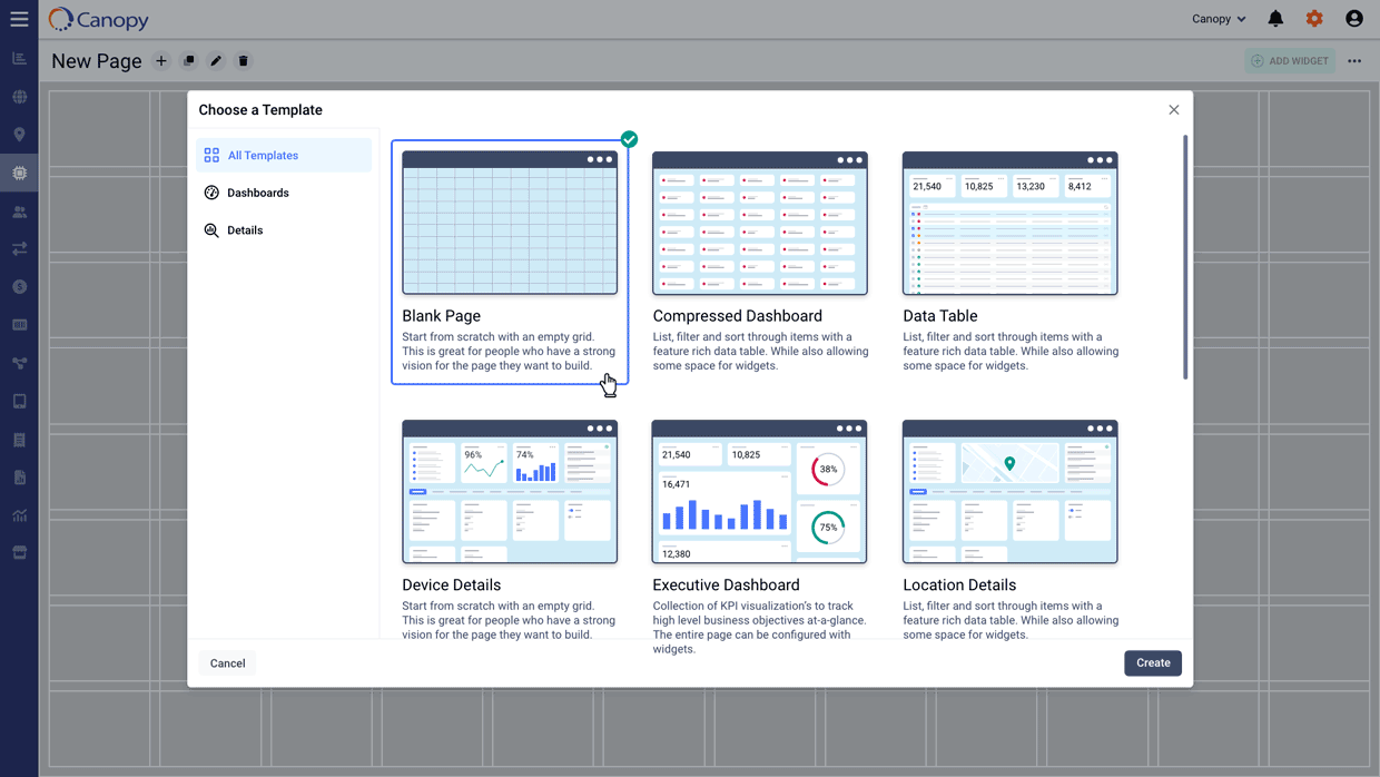
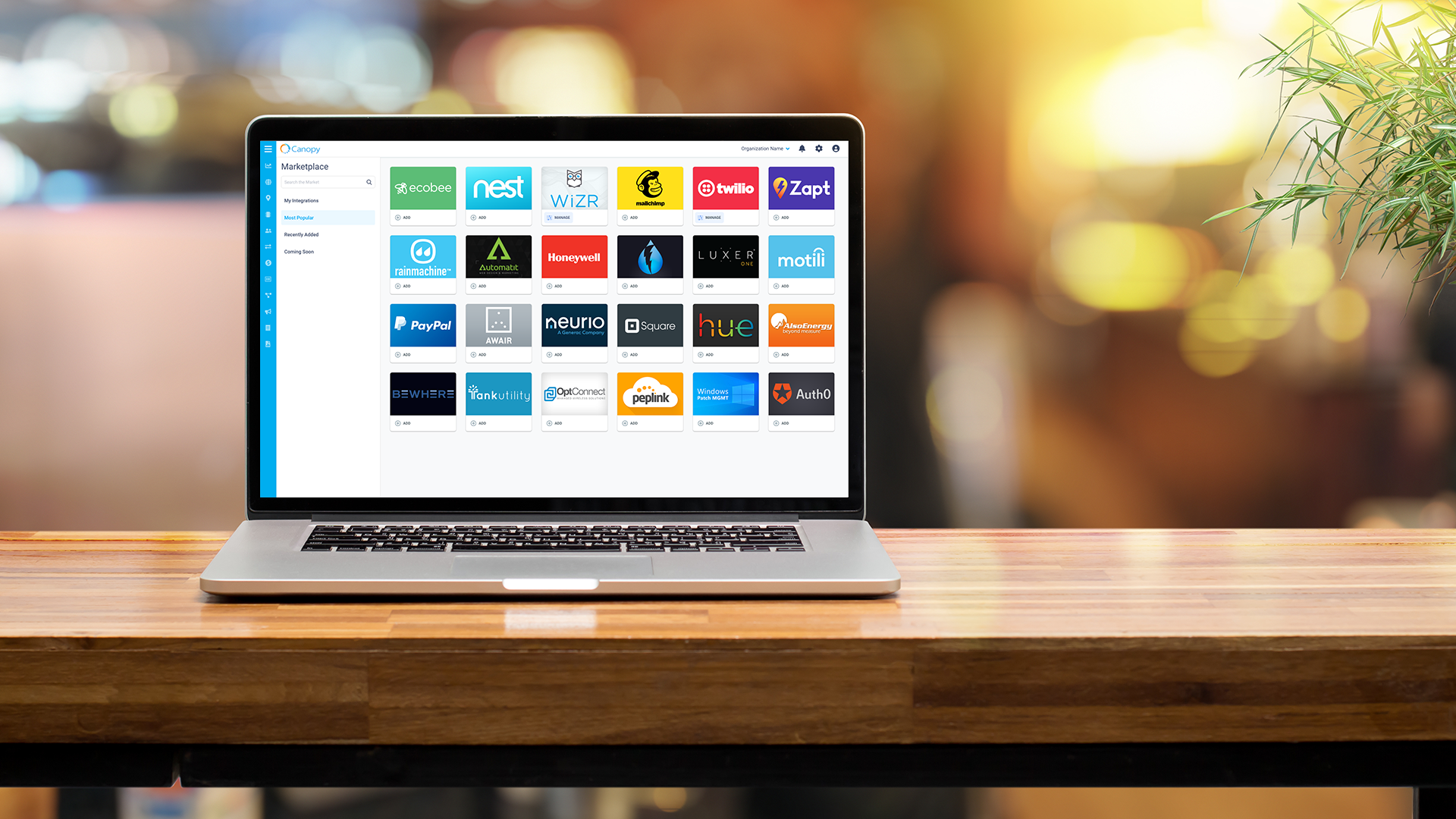
Key Feature: Page Builder
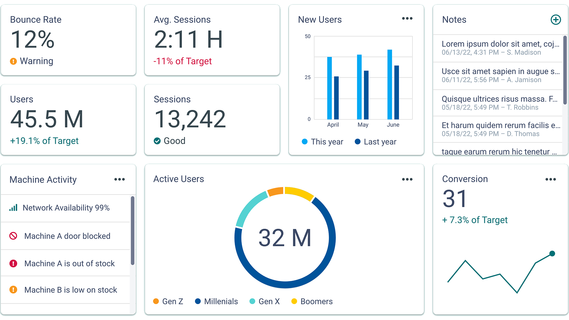
To address the need for personalization, I proposed and led the design of a Page Builder – a modular tool where users can drag-and-drop widgets to create their own dashboards.
- Reduced internal dev cycles spent on custom pages
- Empowered customer to tialor Canopy to thier operational needs
- Set the foundation for future extensibility (e.g., templated pages, shared layouts)
Other Key Enhancements
-
Pinned Actions: Allowed users to save and surface frequently used actions across views.
-
Filter Cards: Introduced a visual rule builder and saveable filters to support complex queries.
-
Automations: Designed a visual scripting tool for proactive issue resolution – preventing downtime without user intervention.
Outcomes
-
Improved NPS and user satisfaction
-
Internal teams reported fewer support requests tied to UI confusion
-
Platform adoption increased among non-technical users
-
Created a scalable design system to support future feature growth
Reflection
This project reinforced the importance of designing for both scale and flexibility. By involving users early, validating assumptions, and focusing on extensibility, we delivered real value—both to users and the internal teams that support them.
If I had more time, I would’ve invested in usability testing with field teams using mobile form factors, as that surfaced later as a need we could expand into.